Showing posts with label infographics. Show all posts

Visualizing Friendships Using Facebook's Social Graph

Paul Butler, a Facebook developer looks at a data visualization exploring the locality of friends.

"When the data is the social graph of 500 million people, there are a lot of lenses through which you can view it. One that piqued my curiosity was the locality of friendship. I was interested in seeing how geography and political borders affected where people lived relative to their friends. I wanted a visualization that would show which cities had a lot of friendships between them."

Read more and find a high res image here:

A World of Tweets


Geography mashup using HTML5, the Twitter API and Yahoo Places. Be sure to scroll down the page for lots of interesting stats.

Twiddle the knobs yourself at:

What a Hundred Million Calls to 311 Reveal About New York

New York's 311 line handles an average of 50,000 calls a day. This article discusses what those calls tell us about the Big Apple, people who live there, and maple syrup.


Gripes by zip code:


Read more at Wired.com. Hat tip, Charlie:

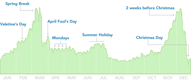
Breaking Up is Hard to Do (Unless It's Almost Christmas)

When are people most likely to break up? Mathias Mikkelsen discusses David McCandless' TED Talk, "The Beauty of Data Visualization", in which McCandless describes insights from analysis of over 10,000 Facebook status updates.

Check out the original TED Talk here:

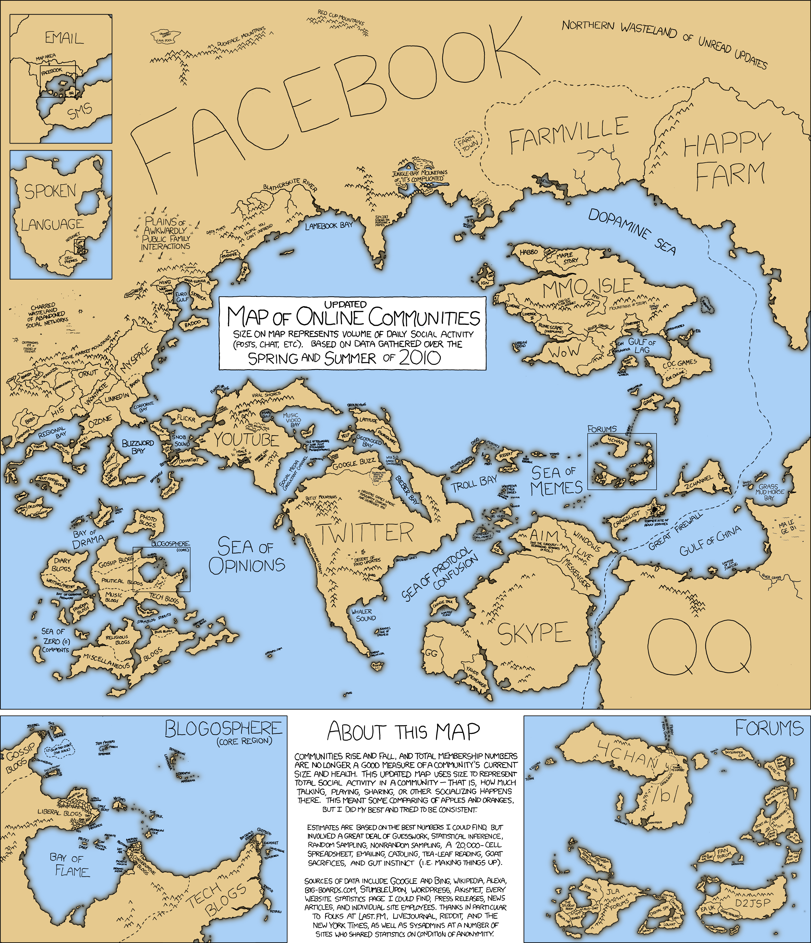
Map of Online Communities


Here is a fun (and insightful) map from the folks at XKCD displaying online communities, measured by daily social activity over spring and summer 2010. See if you can find Kanye's Isle of Sadness!

Check it out at:
 • xkcd.com/
 
Bloggers Team